10,000 search results
(0.067 seconds)
- Northash by Arterfak Project,
$17.00 Introducing Northas the vintage stencil font inspired by the old-school signage and military design. This font has a bit condensed letterform that gives a strong look and dignified. Perfect for many themes such as sports, military, urban, wildlife, vintage, and more! Fonts featured : Uppercase Small caps Numbers Symbols & punctuation Accented characters Alternates Catchwords: in, out, the, with, de, of, at, and, etc. Thank you for your support and happy designing!
 - Night Halloween by Wyarecreatype,
$13.00 Night Halloween is a lovely halloween themed. Wide variety of halloween line art for Stylistic Alternates. Masterfully designed to become a true favourite, this font has the potential to bring each of your creative ideas to the highest level! Perfectly fit for the visual project such as logo, branding, poster, food and beverages, social media content, website, UI/UX design, youtube thumbnail, CV, mood board, wedding, you name it.
 - Vintage Browner by Arterfak Project,
$19.00 Vintage Browner is an exquisitely designed vintage-inspired typeface. Meticulously crafted with an original hand-drawn design, it exudes an old-school charm that is ideal for designs requiring a classic touch. This font is truly a perfect fit for vintage themes, including vintage logos, logotypes, packaging, storefronts, prints, t-shirts, decals, labels, and countless other possibilities. With its special characters, you can create your very own vintage aesthetic designs!
 - Diplomat by Wilton Foundry,
$29.00Diplomat was designed in response to Portfolio’s very ornate script - a much more legible and formal script that has plenty of flare but without the elaborations. It is still more ornate than Duet so if you need to find a script right in between Portfolio and Duet, Diplomat will do the trick! Diplomat in combination with its elegant lowercase, creates a prestigious presentation useful for Certificates, Wedding Invitations, Corporate Identities, Brochures, and Headlines. - Ravenside by Nathatype,
$29.00 Wanna make your branding spark? Do you sometimes have an appetite for a bit more wholesome typography? Looking for a gorgeous and stylish font? We've got what you want. Ravenside - A Blackletter Font Ravenside is a blackletter font with classy, elegant and vintage feel character set. This font is inspired by various fonts and elements. To create the beautiful combination, just mix the uppercase and lowercase then mix with the alternative glyphs. A real head-turner for your presentation, designs, branding, quotes, invitation, website illustrations, and much more. Our font always includes Multilingual Support to make your branding reach a global audience. Features: PUA Encoded Numerals and Punctuation Thank you for downloading premium fonts from Natha Studio
 - Northeast Oregon by Nathatype,
$29.00 Are you looking for a handwritten font? Do you dream of creating headings that stand out and inspire creativity, imagination, and endless fun? Wait no more, we will give you the best choice. Northeast Oregon-A Handwritten Font Northeast Oregon is a elegant designed with a modern vibe. It brings charming curves and satisfying patterns This handwritten font is perfect for anything beautiful and neat.. A real head-turner for your presentation, designs, branding, quotes, invitation, website illustrations, and much more. Our font always includes Multilingual Support to make your branding reach a global audience. Features: Ligatures Stylistic Sets PUA Encoded Numerals and Punctuation Thank you for downloading premium fonts from Din Studio
 - Spoonbill by Scriptorium,
$12.00In 1916 the Prang company - still famous for their excellent pens and pencils - commissioned Thomas Woods Stevens to hire the best calligraphers of the era to hand letter sample pages with different Prang pens and in a variety of styles. The resulting book is a font maker's dream, a collection of period lettering samples perfect for making new fonts. One of the sample pages shows off the look of the Spoonbill pen with a set of classic art deco style letters by Charles Earley. This sample is the basis for our Spoonbill font, which includes a full character set, plus character variations for nesting and overlapping, and a small selection of decorative border characters in the art deco style. - Agefin Regad by Product Type,
$17.00 Introducing Agefin Regad, the perfect solution for your superhero-themed projects! With its bold and standout serif design, Agefin Regad is the ideal font for any project that requires a robust and impactful look. Agefin Regad comes in two families: regular and slant, allowing you to choose the perfect style for your design. Whether you’re creating logos, headlines, or posters, Agefin Regad has got you covered. With its unique and attention-grabbing design, Agefin Regad is the perfect choice for projects that need to stand out from the crowd. And with its multilingual support, you can use it for projects all over the world. Get Agefin Regad today and take your superhero-themed designs to the next level! What’s Included : File font All glyphs Iso Latin 1 Ligature, Alternate We highly recommend using a program that supports OpenType features and Glyphs panels like many Adobe apps and Corel Draw, so you can see and access all Glyph variations. PUA Encoded Characters – Fully accessible without additional design software. Fonts include Multilingual support
 - Yellow Palette by Din Studio,
$29.00 Are you looking for a handwritten font? Do you dream of creating headings that stand out and inspire creativity, imagination, and endless fun? Wait no more, we will give you the best choice. Yellow Palette-A Handwritten Font Yellow Palette is a gorgeous font, designed with a modern vibe. This handwritten font is perfect for anything adventurous, and direct. Every stroke and curve was created to entice happiness and elegance. A real head-turner for your presentation, designs, branding, quotes, invitation, website illustrations, and much more. Our font always includes Multilingual Support to make your branding reach a global audience. Inspire your audience, clients, or guests with this beautiful, statement font. Features: Ligatures Stylistic Sets PUA Encoded Numerals and Punctuation Thank you for downloading premium fonts from Din Studio
 - Comic Sidekick by Wing's Art Studio,
$6.00 Comic Sidekick: A Screwball Comedy Font Family! A hand-drawn brush font with multiple styles, perfect for light-hearted designs such as comics and children’s books, film posters, titles, games and packaging. This 11 font family includes variations on a core theme that can be layered up for interesting effects or used individually for a cleaner look. Led by its regular chunky design, this is accompanied by outline, inline, brush and pen variants offering multiple options to mix and match while staying within consistent boundaries. Also included are a bundle of comic shapes including speech bubbles, underlines, banners and other random objects for experimenting with.
 - Kithan by Ixipcalli,
$26.00 Kithan is a font that provides three weights and three compressed from semi-fine to bold, while the compressed have a reduced contrast creating a tall and soft look. Bold font sizes allow letterforms to be appreciated, with the same restraint and focus. Creates a smooth texture for small font sizes and long reads. Kithan's theme is inspired by the Mexican currency of the year 2000.
 - Bageurville by Alvian Hasby,
$9.00 Bageurville is a modern serif inspired by a transitional style. Built with curved characters and rounded shapes on the ears and terminals that are formed based on circles, making them have kindness and historical touch. Bageurville has more than 250 glyphs, basic ligatures, and support multilingual. Nicely suitable for title or body purposes such as books, editorials, invitations, greeting cards, and branding.
 - Stop by Linotype,
$29.99Stop is a heavy futuristic sans serif display font, designed by the famed Italian type designer Aldo Novarese. Stop's forms are vaguely stencil-like, and some of them only read as letters when used in combination with each other. Nevertheless, Stop has a real computer-technology" feel to its design. It should be used exclusively for headlines or logo work." - Bella Notes by Attype Studio,
$14.00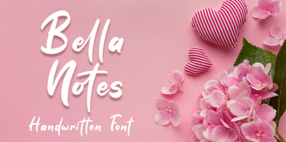 Bella Notes is lovely Handwritten font, including ligatures that perfect for any combination for your design. Bella Notes perfectly macth for design with valentine theme, any product like book cover, t-shirt, branding, promotion, social media post, quotes, wedding, photography and more. What's included: - Ligatures - Multilingual Support
 - Pompano by Letterhend,
$17.00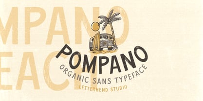 Pompano is an organic sans serif typeface which is purposely made for headline, display or logotype.This type of font perfectly made to be applied especially in logo, and the other various formal forms such as invitations, labels, logos, magazines, books, greeting / wedding cards, packaging, fashion, make up, stationery, novels, labels or any type of advertising purpose. Features : regular & stamp version uppercase & lowercase numbers and punctuation multilingual alternates & ligatures PUA encoded We highly recommend using a program that supports OpenType features and Glyphs panels like many of Adobe apps and Corel Draw, so you can see and access all Glyph variations.
 - Display Of Character by Fontscafe,
$29.00 Who is not totally captured when looking at those marvelously handmade old manuscripts, where letters, borders and elements were so masterfully realized with some touch of Gold leaf (or Silver in some cases) that was making of an ordinary book a piece of art? The name of the pack “Illuminated” comes, like the ancient art used for the old manuscripts, from the latin word “Illuminare” (to light up) and it’s symbol of great value, preciousness and beauty skilfully created with patience and love from artists for centuries. What we at Fontscafe wanted to give you was the opportunity to get a whole “ready to use” set of fonts that could, in a modern and revised form, give that “Illuminated” feeling to our “Digital Era”. A set of new tools to make your art shining!
 - Wooden Alphabet by Yumna Type,
$25.00 Wooden Alphabet is a peculiar wood texture and shape-inspiring display font having unique, attractive letter designs in prominent uppercases along with wood textures to express natural nuances. All of the font letters are very carefully, smoothly designed in detail as if they were made of real wood. In fact, wood textures on the letters leave the impressions of warmth and nature on the designs. Wooden Alphabet excels at the ability to create natural impressions and warm nuances in order to make your designs look interestingly different for increasing the product’s attractiveness. Such a wood-themed font is a perfect match for any nature, environment, or organic related products. To be greatly legible, you can use it for big text sizes. Wooden Alphabet provides a clipart in accordance with the font theme as a bonus and features you can enjoy. Features: Multilingual Supports PUA Encoded Numerals and Punctuations Wooden Alphabet fits best for various design projects, such as brandings, headings, magazine covers, quotes, printed products, merchandise, social media, etc. Find out more ways to use this font by taking a look at the font preview. Thanks for purchasing our fonts. Hopefully, you have a great time using our font. Feel free to contact us anytime for further information or when you have trouble with the font. Thanks a lot and happy designing.
 - Steinweiss Script by Alphabet Soup,
$59.00 Steinweiss Script began its journey towards daylight when Michael Doret was asked by Taschen Publishing to do cover lettering for the huge commemorative edition they were putting together on the work of Alex Steinweiss—“The Inventor of the Modern Album Cover”. The lettering was to be created to appear similar to the famous “Steinweiss Scrawl” the calligraphy that Steinweiss had used on countless album covers. While designing this piece of lettering, Michael realized that there was great potential for a font that was designed in the spirit of that famous “scrawl”. Through his contacts at Taschen Publishing, he was fortunate enough to be able to contact the Steinweiss family, and get the official Steinweiss approval to proceed with his “Steinweiss Script” project. Michael decided that in addition to giving the font his name as an homage, that he would donate a portion of the proceeds from the sale of this font to the man himself: Alex Steinweiss. Read more about the background of Steinweiss Script in Steven Heller’s article in Imprint. Steinweiss Script is a family of fonts in three weights: Light, Medium, and Bold. Additionally, within each weight there are three variations: Simple, Fancy, and Titling. These variations relate to the size/ratio of the caps to the lowercase, the complexity of those caps, and the size of the ascenders/descenders on the lowercase characters. These variations add usefulness to the font, making it accessible not just for headlines, but for longer passages of text as well. For a better understanding of its unique features please download The Steinweiss Script Users Guide from the Gallery section. PLEASE NOTE: the three Steinweiss Script fonts are cross-platform fonts which depend to some extent on certain advanced OpenType features, therefore they can be used to their full potential only with programs that support those features. When setting Steinweiss Script one should almost ALWAYS select the “Standard Ligatures" and “Contextual Alternates” buttons in your OpenType palette. See the “Read Me First!” file in the Gallery section.
 - Alma Mater by Studio K,
$45.00 As the Latin tag for one’s college or university, Alma Mater seemed to me to be an appropriate title for a font family reminiscent of the lettering commonly used on college sweaters and sports jerseys. Essentially Alma Mater is an extension of my Oscar Bravo font family, but the lively demand for Oscar Bravo Blank persuaded me to go the whole nine yards and and offer inline, outline and shadow variations on the theme. Pick 'em up and run with 'em!
 - Skiltmaler by Imagi Type,
$15.00 Skiltmaler is the typeface that refers to the style of decorative arts during the Victorian era 1837 to 1901, the Victorian era was the period in which fly poster typography emerged. The large amount of colour in combination with large font sizes were created from movable metal type. As well as being made from wood, this was used to create the two-coloured typefaces. You would imagine this would be specific to the '3D' styled type seen on the poster to create the drop shadow. Skiltmaler works well with normal size text, but it works even better for large displays, short words, or even just to incorporate a few or single characters in a design.
 - ITC Syndor by ITC,
$29.99ITC Syndor is the work of Swiss designer Hans Eduard Meier, a font which is almost, but not quite, a sans serif. The beginnings and endings of strokes display a hint of the calligrapher's hand and these tiny serifs optimize legibility. This legibility and the typeface's simple forms make ITC Syndor an excellent choice for business and presentation graphics. - Anthropology by Arendxstudio,
$17.00 Introducing my new font Anthropology, wrapped elegantly and has distinctive characteristics making this font beautiful. Anthropology is perfect for branding projects, logos, wedding designs, media posts, advertisements, product packaging, product designs, labels, photography, watermarks, invitations, stationery, and any project who need a handwritten style. Features: • Character Set A-Z • Numerals & Punctuations (OpenType Standard) • Accents (Multilingual characters) • Ligature • Alternate There it is! I really hope you enjoy it - comments & likes are always welcome and accepted. More importantly, don't hesitate to send a message if you have a problem or question. Now just read this, go there and make it happen :)
 - Morning News by Wiescher Design,
$39.50 Morning News is the sister font of Evening News which I designed some years ago for use with my local newspaper Abendzeitung. Morning News is an adaption, a little bit rounder, which gives the font a much softer touch. The general design dates back to the pre-Hitler era, the time when Germany had already lost the first World War and was taking a short deadly breath to start the second big war. Lets hope there will be a day when there will never be another war in Europe (or elsewhere!). Another new peaceful font by your pacifistic designer, Gert Wiescher.
 - Acaphy by Craft Supply Co,
$20.00 Introducing Acaphy – Bubble Font: Fun and Playful Typography for Kids Playful and Vibrant Looking for a font that radiates fun and playfulness for your kids’ themed projects? Acaphy – Bubble Font is your ideal choice! With its bubbly and rounded characters, it instantly infuses joy and excitement into your display. Clear and Readable Acaphy – Bubble Font ensures easy readability, making it perfect for young readers. Its simple letterforms help children recognize and understand text effortlessly. Whether it’s educational materials, invitations, or posters, this font does the job brilliantly.
 - Hebrew Century by Samtype,
$39.00 This is a font from the 10th century and is still pretty. This is a classic format.
 - Bayshore by Set Sail Studios,
$18.00 Perm your hair, squeeze into your lycra, and retro-fy your text with Bayshore! A totally tubular mono-line script font straight out of the 80's. This hand-drawn font is perfect for creating slick & stylish lettering. Whether it’s for logos, product packaging or merchandise, Bayshore is guaranteed to give your text an unmistakeable retro quality. Bayshore comes as a single font file with added features allowing you to customise your text; End Swashes • Each lower-case character has a separate ‘end-swash’ version, use this for the last letter in a word to give it a custom-feel styling. These end-swashes are accessible via any software with Opentype capabilities, simply by turning on ‘Stylistic Alternates’. Underline Swashes • Four swashes of varying lengths are also available, simply by typing any of the square brackets [ ] { }. These can be used to underline your text and give it a real eye-catching quality.
 - Depot Trapharet 2D by 2D Typo,
$- The Depot Trapharet 2D is based on lettering of Lviv tram stands describing the city tram routes. The font is characterized by brutal simplicity bordering with primitivity.
 - National Currency by Decade Typefoundry,
$25.00 This font was inspired by lettering found on old stock certificate on the 19th century and comes with two guilloche borders, which makes national currency very useful.
 - Fontella by Canada Type,
$24.95 Italian type design master Aldo Novarese was not famous for making calligraphic designs, nor had he any interest in them. He is much better known for his text faces, and quite innovative sans serif and decorative designs which became the definition of what we now know as techno and modern. But in 1968, Novarese surprised everyone with a fantastic flowing deco script entitled Elite. Novarese's formula of simple soft curves and toned-down swashes makes for one of the most unique alphabets ever seen, not to mention one of the best flowing and most legible scripts. This is now its digital incarnation, named Fontella. Fontella's applications are virtually limitless. This is the sort of script that can feel at home pretty much anywhere; a sign, a fridge magnet, a bumper sticker, a greeting card, a movie poster, a book cover, music artwork, magazine ads, newsletter headlines, etc. Digitized from original specimen and expanded with a few built-in alternates and ligatures by Rebecca Alaccari, the font was named after the famed jazz singer Fontella Bass. These letters are just so sweet they had to be called Fontella.
 - The Dagoda by Hrz Studio,
$17.00 The Dagoda is a calligraphy script font that comes with beautiful alternate characters. copper plate calligraphy alloy with handlettering style. Designed to convey stylish elegance. The Dagoda is attractive because it is subtle, clean, feminine, sensual, glamorous, simple and very easy to read. Classic style is very suitable to be applied in all types of formal work such as invitations, labels, menus, logos, fashion, make up, stationery, letterpress, romantic novels, magazines, books, greeting/wedding cards, packaging, labels. Dagoda features a glyph and alternate characters. including multiple language support. It features OpenType with character styling, binding, and stroke, allowing you to mix and match letter pairs to match your design. Files include: To enable the OpenType Stylistic alternative, you need a program that supports OpenType features such as Adobe Illustrator CS, Adobe Indesign & CorelDraw X6-X7, Microsoft Word 2010 or later. (Windows), Font Book (Mac) or a software program such as PopChar (for Windows and Mac). How to access all alternative characters using Adobe Illustrator: https://www.youtube.com/watch?v=XzwjMkbB-wQ How to use the font style set in Microsoft Word 2010 or later: https://www.youtube.com/watch?v=NVJlZQ3EZU0 There are additional ways to access alternatives/swashes, using Character Maps (Windows), Nexus Fonts (Windows) Font Book (Mac) or software programs such as PopChar (for Windows and Mac). How to access all alternative characters, using Windows Character Map with Photoshop: https://www.youtube.com/watch?v=Go9vacoYmBw If you need help or advice, please contact me. Thank you for your purchase!
 - Vanitha by Arterfak Project,
$18.00 Vanitha is a bold script font, inspired by vintage logos and old-school sign painting. This font is made with hand drawings and still pays attention to the calligraphic form so that it looks modern and unique. Vanitha is a display font, which you can use as logos, logotypes, merchandise, sports themes, flags, banners, stickers, labels, posters, and others. This font is also equipped with stylistic alternates to beautify your typographic design. Thank you for your support!
 - Parity Sans by Shinntype,
$19.00 The Parity concept takes the minimalist unicase alphabet and expands it in another dimension, that of the megafamily encompassing a variety of weights, optical sizes and styles (roman/italic, serif/sans, proportional/monowidth)—of benefit whether fine tuning a single, quite specific font for the task at hand, or harmoniously combining several in the hierarchy of a multi-formatted page layout.
 - Haweni by Twinletter,
$15.00 Halloween has never been so much fun. You don’t need to go near a spooky house in the dead of night or deal with creepy creatures while you wait for trick-or-treaters to pass out candy. With this Halloween font and our new Halloween-themed templates, it will be easy to get your Halloween party started without all that hard work! Of course with this font your various design projects will be perfect and amazing, get a beautiful title and start using our font for your special project.
 - Mozzart Sketch by Posterizer KG,
$19.00 Mozzart Sketch is a decorative version of Mozzart Sans, slightly rounded, Neo-Grotesque corporate font, created for MOZZART D.O.O. company from Belgrade, Serbia. Mozzart Sketch is a decorative hand-sketched font for headlines and short texts, and also very readable in small weights. All glyphs were carefully hand drawn, with marker as a tool, then traced and digitized. The family contains: 5 Weights, 3 Condensed and 1 Oblique versions of the font, complementing each other perfectly. All versions contains completely MacOS Roman and MacOS Cyrillic code pages, tabular figures, small caps... perfect for profesional designers and very useful for artistic things, catalogues, music... and many other sensual and beautiful things. Enjoy!
 - Clephons by Zamjump,
$13.00 Introducing, Clephons is a captivating serif display font that exudes timeless elegance. Crafted as an all-capital typeface, this font is a homage to vintage letterforms, blending classic charm with a touch of modern sophistication. Perfectly tailored for branding, headlines, logos, and designs with a classic or vintage theme, Clephons effortlessly captures the essence of a bygone era. Its distinctive serifs and refined details make it a versatile choice for projects that demand a touch of retro flair. Elevate your designs with Clephons, where every character tells a story of refined aesthetics and enduring style. **Uppercase
 - City Boys Soft by Dharma Type,
$19.99 City Boys Soft is a fashionable contrasted sans-serif that can be used in almost any situation. City Boys has basic, natural and neutral letterforms and skeletons for a wide range of usage. The glyphs are somewhat humanist yet they have vertical stress for modern and sophisticated impression. The ratio of the contrast was carefully designed for modern usage –websites, digital, printings and merchandises–. City Boys consists of 7 weights and their matching Italics for a wide range of usages. Farther, City Boys is supporting international Latin languages and basic Cyrillic languages including Basic Latin, Western Europe, Central and South-Eastern Europe. Also CSS covers Mac Roman, Windows1252, Adobe1 to 3. This wide range of international characters expands the capability of your works. City Boys is a normal corner version of this City Boys Soft.
 - Hot Script by Lián Types,
$49.00 Say hello to another of my hot and trendy scripts, Hot Script! I got the inspiration for this one in the world of sign painters. My neighbourhood, and more specifically the avenue were I live, is very well known for its ''parrillas'': For those who don't know what this means, well, it may be better to live the experience rather than reading these lines. Villa Urquiza is full of restaurants with an argentinian flavour, with a ''gauchezco'' feel. Here you can taste some of the best ''asados'' in the entire world. Ok, this made me hungry, let's go back to type: These amazing venues still mantain genuine elements from the past, and try to preserve the beauty of the handcrafted. Parrillas of Buenos Aires have all their walls, windows and doors lettered with chalk or paint. I've always wanted to make a font out of that, and Hot Script is my first attempt. I believe the results are great! Hot Script follows some rules of the flat brush (see terminals, and tails especially in caps) but its contrast of thicks and thins was manually altered to make the font better for a wider range of uses. Although the sexy curves and versatility of Hot seemed to be enough, I decided to spice it a little more by creating some layers for it: Hot Script Shine Solo or Hot Script Shades Solo combined with Hot Script will give outstanding results. (Look for them combined in the posters above and dare to deny it!) Go make your project more savory! This font is Hot, hot, hot!
 - 112 Hours by Device,
$9.00 Rian Hughes’ 15th collection of fonts, “112 Hours”, is entirely dedicated to numbers. Culled from a myriad of sources – clock faces, tickets, watches house numbers – it is an eclectic and wide-ranging set. Each font contains only numerals and related punctuation – no letters. A new book has been designed by Hughes to show the collection, and includes sample settings, complete character sets, source material and an introduction. This is available print-to-order on Blurb in paperback and hardback: http://www.blurb.com/b/5539073-112-hours-hardback http://www.blurb.com/b/5539045-112-hours-paperback From the introduction: The idea for this, the fifteenth Device Fonts collection, began when I came across an online auction site dedicated to antique clocks. I was mesmerized by the inventive and bizarre numerals on their faces. Shorn of the need to extend the internal logic of a typeface through the entire alphabet, the designers of these treasures were free to explore interesting forms and shapes that would otherwise be denied them. Given this horological starting point, I decided to produce 12 fonts, each featuring just the numbers from 1 to 12 and, where appropriate, a small set of supporting characters — in most cases, the international currency symbols, a colon, full stop, hyphen, slash and the number sign. 10, 11 and 12 I opted to place in the capital A, B and C slots. Each font is shown in its entirety here. I soon passed 12, so the next logical finish line was 24. Like a typographic Jack Bauer, I soon passed that too -— the more I researched, the more I came across interesting and unique examples that insisted on digitization, or that inspired me to explore some new design direction. The sources broadened to include tickets, numbering machines, ecclesiastical brass plates and more. Though not derived from clock faces, I opted to keep the 1-12 conceit for consistency, which allowed me to design what are effectively numerical ligatures. I finally concluded one hundred fonts over my original estimate at 112. Even though it’s not strictly divisible by 12, the number has a certain symmetry, I reasoned, and was as good a place as any to round off the project. An overview reveals a broad range that nonetheless fall into several loose categories. There are fairly faithful revivals, only diverging from their source material to even out inconsistencies and regularize weighting or shape to make them more functional in a modern context; designs taken directly from the source material, preserving all the inky grit and character of the original; designs that are loosely based on a couple of numbers from the source material but diverge dramatically for reasons of improved aesthetics or mere whim; and entirely new designs with no historical precedent. As projects like this evolve (and, to be frank, get out of hand), they can take you in directions and to places you didn’t envisage when you first set out. Along the way, I corresponded with experts in railway livery, and now know about the history of cab side and smokebox plates; I travelled to the Musée de l’imprimerie in Nantes, France, to examine their numbering machines; I photographed house numbers in Paris, Florence, Venice, Amsterdam and here in the UK; I delved into my collection of tickets, passes and printed ephemera; I visited the Science Museum in London, the Royal Signals Museum in Dorset, and the Museum of London to source early adding machines, war-time telegraphs and post-war ration books. I photographed watches at Worthing Museum, weighing scales large enough to stand on in a Brick Lane pub, and digital station clocks at Baker Street tube station. I went to the London Under-ground archive at Acton Depot, where you can see all manner of vintage enamel signs and woodblock type; I photographed grocer’s stalls in East End street markets; I dug out old clocks I recalled from childhood at my parents’ place, examined old manual typewriters and cash tills, and crouched down with a torch to look at my electricity meter. I found out that Jane Fonda kicked a policeman, and unusually for someone with a lifelong aversion to sport, picked up some horse-racing jargon. I share some of that research here. In many cases I have not been slavish about staying close to the source material if I didn’t think it warranted it, so a close comparison will reveal differences. These changes could be made for aesthetic reasons, functional reasons (the originals didn’t need to be set in any combination, for example), or just reasons of personal taste. Where reference for the additional characters were not available — which was always the case with fonts derived from clock faces — I have endeavored to design them in a sympathetic style. I may even extend some of these to the full alphabet in the future. If I do, these number-only fonts could be considered as experimental design exercises: forays into form to probe interesting new graphic possibilities.
 - Kuschelfraktur by Catharsis Fonts,
$36.00 Kuschelfraktur is a unique, eye-catching take on the theme of blackletter that replaces the broad nib with a brush pen and achieves stroke modulation through stencil-like gaps. It combines the texture and dignity of blackletter with the human warmth of informal handwriting. Kuschelfraktur offers five separate sets of capital letters and several additional customization option via stylistic alternates. The degree of ornamentation in the blackletter capitals can be increased (SS02) or decreased (SS07), while SS04 and SS05 offer two simpler approaches to capital letters that bridge from blackletter to Roman letters (Antiqua). The default single-storey �a� can be replaced with a two-storey version in SS01, and SS08 offers a single-storey capital �A� for the simple capitals. Finally, SS03 restores some of the more unique letter shapes of the Fraktur style of blackletter. The old-style figures can be replaced with lining and/or tabular figures. All these stylistic sets are accessible via OpenType from the main font, Kuschelfraktur, whereas the spin-off fonts (Traditional, Verziert, Text, Schlicht, Antiqua) offer convenient access to those sets even in environments without OpenType support. I am grateful to the helpful souls on the TypeDrawers and Typographie.info forums for encouragement and constructive feedback, and to the Glyphs team for their fantastic type editor. Kuschelfraktur is dedicated to my son Marius.
 - Artegra Soft by Artegra,
$29.00 Artegra Soft is the round cornered addition to the Artegra superfamily. It's based on the perfectionist geometric forms of Artegra Sans, all the glyphs are softened with round corners with manual corrections to the soft edges. The family has 54 fonts in condensed, normal and extended widths, 9 weights per width with matching true italics to achieve the upmost versatility.